
Self-Publishing & KDP
Kindle eBook Accessibility Guide: Alt Text, Headings & KDP Checks (2026)
Kindle ebook accessibility made practical: alt text, heading structure, clear links, contrast, tables, and Previewer checks for KDP authors.
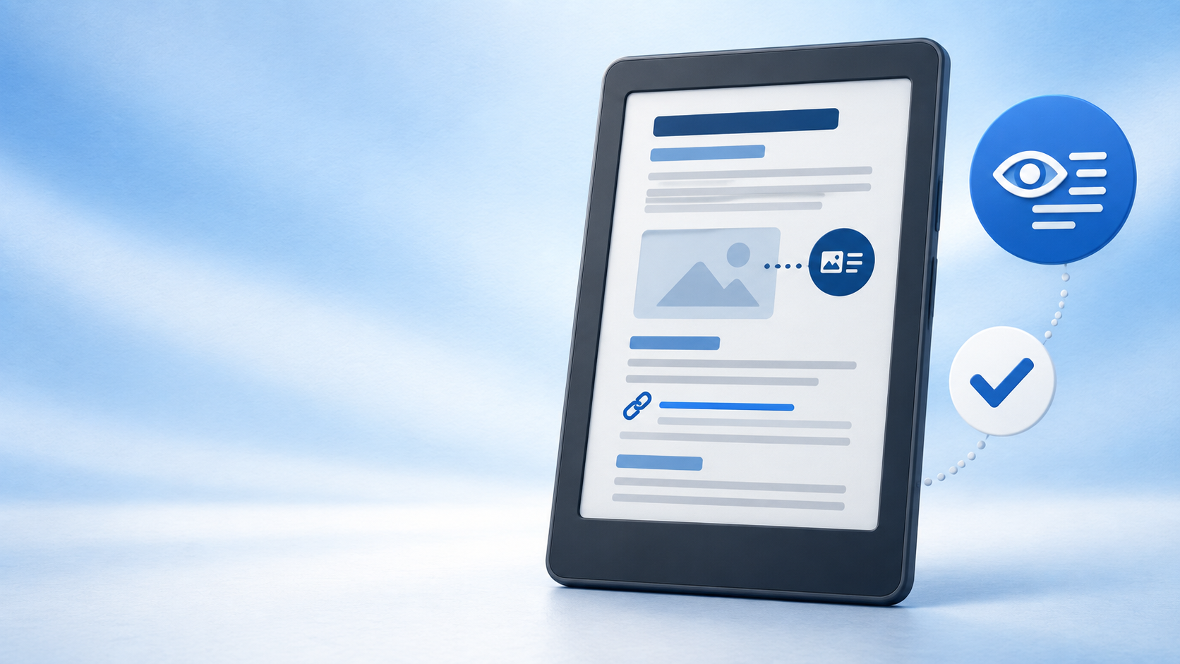
To make a Kindle ebook easier to use, build it with real headings, clear links, meaningful image descriptions, readable contrast, and a final Kindle Previewer check. These practical publishing choices help readers navigate with assistive technology and help every reader follow the book on a phone, tablet, or e-reader.
Accessibility starts with a well-structured manuscript. A chapter title that is only bold, a link labelled “click here,” or a diagram with no description can block useful information for a reader using a screen reader. A clean structure improves navigation, conversion, and the ordinary reading experience at the same time.
What accessible Kindle formatting means
An accessible reflowable ebook lets the reader change type size, use Kindle navigation, understand links, and access the information carried by meaningful images. Amazon’s current QA standards flag missing or incorrectly nested headings, vague links, insufficient contrast, poorly structured tables, and images without text alternatives as accessibility errors.
Build accessibility into the source file, then check the converted ebook.
Kindle ebook accessibility checklist
| Element | Practical check | Why it matters |
|---|---|---|
| Headings | Use a logical hierarchy: chapters, sections, then subsections. | Readers can navigate the book’s structure without visually scanning every page. |
| Images | Add concise alt text to meaningful images; mark decorative images as decorative. | Screen-reader users receive the information the image contributes. |
| Links | Make link text describe its destination or purpose. | Links make sense when read out of surrounding context. |
| Colour and tables | Keep text readable against its background and use simple, structured tables. | Content stays understandable across devices and assistive tools. |
| Preview | Check navigation, type resizing, images, links, and reading order. | Source-file choices can change during conversion. |
Use real headings, not visual formatting alone
Start every chapter with a real Heading 1 style in Word or the equivalent structural heading in your EPUB. Use Heading 2 for major sections and Heading 3 only underneath an appropriate Heading 2. Do not jump from a chapter heading straight to a lower-level heading simply because it looks smaller on the page.
This structure supports Kindle navigation and gives screen-reader users a reliable map of the book. It also creates a much better starting point for a linked table of contents. If your chapter titles are not yet structured, review our Kindle ebook table of contents guide before creating the final EPUB.
Write useful alt text for meaningful ebook images
Alt text is a short description embedded with an image. Amazon says that images providing information, context, or enhanced understanding need a text alternative, and recommends keeping the description to a maximum of 140 characters. Describe the purpose or takeaway—not every decorative detail.
For example, alt text for a useful chart might be: “Sales rise from 120 copies in January to 310 in June.” For a linked image, describe the action or destination instead, such as “Download the author worksheet.” If an image is purely ornamental and adds no information, mark it as decorative rather than repeating visual clutter to the reader.
Do not hide essential words inside an image. Where possible, use actual text in the manuscript so it can resize, be searched, and be read by assistive technology. This is especially important for diagrams, callouts, and data labels.
Make links, colour, and tables clear
Use descriptive link text
Replace “click here” or a bare URL with wording that states the destination. “Read Cebooker’s Kindle and EPUB formatting service” gives the reader useful context before activating the link. KDP’s QA guidance specifically identifies improperly described links as an accessibility concern.
Do not rely on colour alone
Colour can support meaning, but it should not carry it alone. Label a warning as “Important” instead of using only red text, and keep enough contrast between text and its background. Amazon points to the WCAG recommendation of at least a 4.5:1 contrast ratio for regular text.
Keep tables simple
Complex tables are difficult on narrow screens and can be confusing to assistive technology. Use a clear header row, avoid merged cells when possible, and move long explanations into normal paragraphs if the table becomes dense. Clean ebook structure is one reason a digital file should not simply be copied from a print layout; see our guide to ebook versus paperback formatting.
Test the converted ebook before uploading to KDP
- Open the finished EPUB, DOCX, or KPF in the current Kindle Previewer.
- Check the Kindle navigation pane: chapter and section entries should be complete and in order.
- Increase and reduce font size to make sure regular text reflows naturally.
- Review every meaningful image: it should be sharp, useful, and supported by a description in the source.
- Follow all internal and external links, including the table of contents.
- Switch device type, orientation, and font settings before making a final KDP upload.
Kindle Previewer can show a book on e-readers, phones, and tablets, in different orientations and font sizes. KDP’s Online Previewer adds a final quality check during title setup. A professional Kindle formatting review can catch source-level issues before conversion and device testing.
Need an accessible, reader-friendly Kindle ebook?
Cebooker Studio formats reflowable ebooks with clean heading structure, clickable navigation, careful image treatment, and KDP-ready delivery. We can also prepare your print edition as a separate, purpose-built file through our paperback formatting and cover design service.
Request an ebook accessibility review
Frequently asked questions
Does KDP require alt text for Kindle ebook images?
Amazon’s image guidance says all images need text in the HTML alt attribute for accessibility. Meaningful images should have concise descriptions; decorative images should be treated as decorative.
How long should ebook alt text be?
Amazon recommends a maximum of 140 characters. Focus on the information the reader needs from the image, not a full visual inventory.
Can I make a Kindle ebook accessible from Microsoft Word?
Yes. Begin with real Word heading styles, readable source text, meaningful image descriptions, and clear links. Then review the converted file in Kindle Previewer before uploading it to KDP.
What contrast should I use in an ebook?
Use dark text on a light background or another clearly readable combination. Amazon’s QA standards reference WCAG’s recommended 4.5:1 minimum contrast ratio for regular text.
Is accessibility useful only for nonfiction books?
No. Every ebook benefits from structured chapters, clear navigation, readable text, and reliable links. Books with illustrations, diagrams, charts, or reference sections need particular care with image descriptions and structure.
Official KDP sources
About Cebooker Studio
Chinthaka is an ebook design and digital publishing specialist with more than 13 years of experience and thousands of completed client projects. Cebooker Studio prepares professional PDF publications, Kindle and EPUB files, paperback interiors, and book covers for authors and businesses worldwide.